Nonprofit puts on a new face to be truly user-friendly, differentiate its contents and use a responsive design.
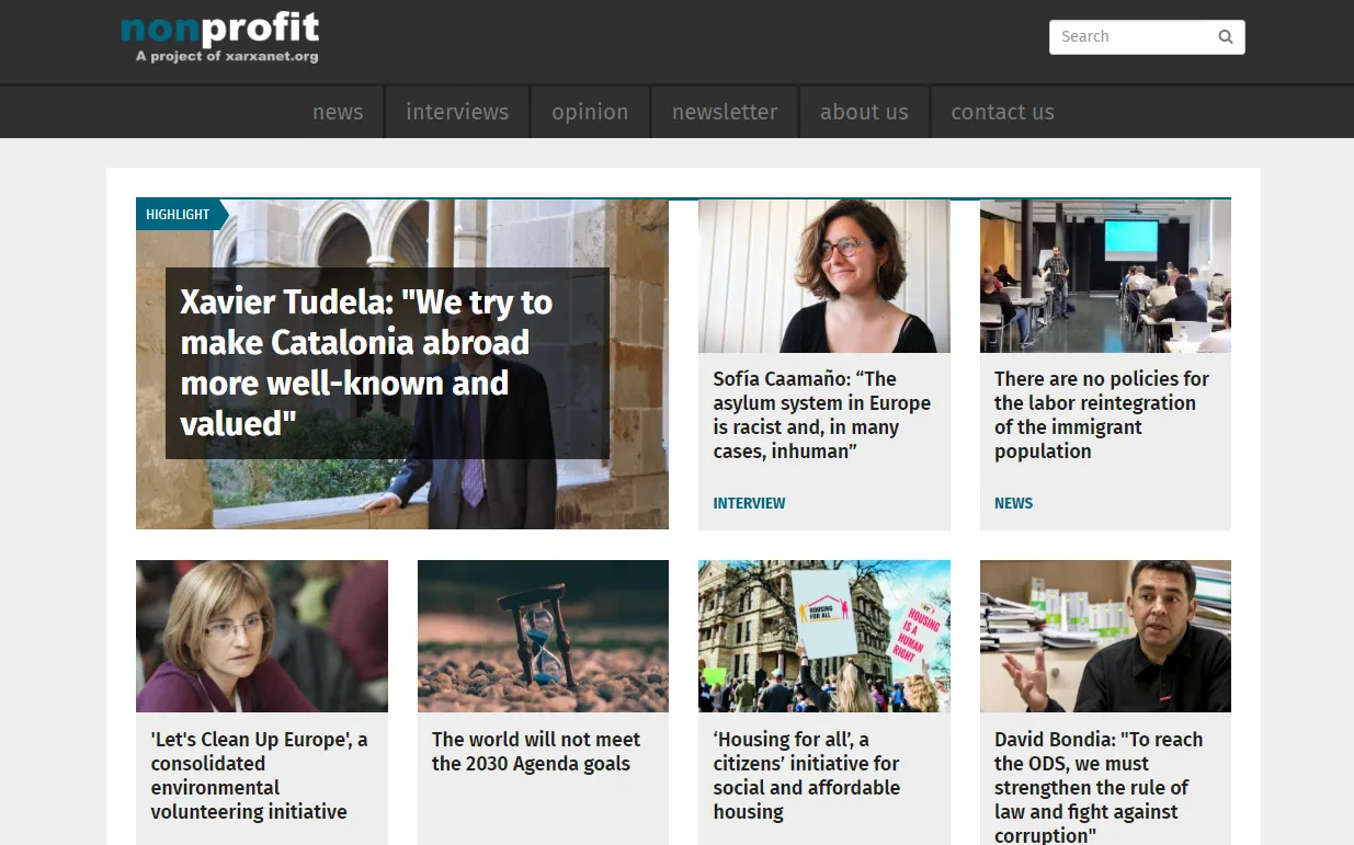
Nonprofit, the international portal of non-profit organizations and volunteering, was set up three years ago, and now it is time to put on a new face. An innovative design to present the contents with more clarity so that users find what they’re looking for more easily. The portal now displays news items that are published weekly in a much more coherent way, with especially dedicated tabs and info on the homepage.
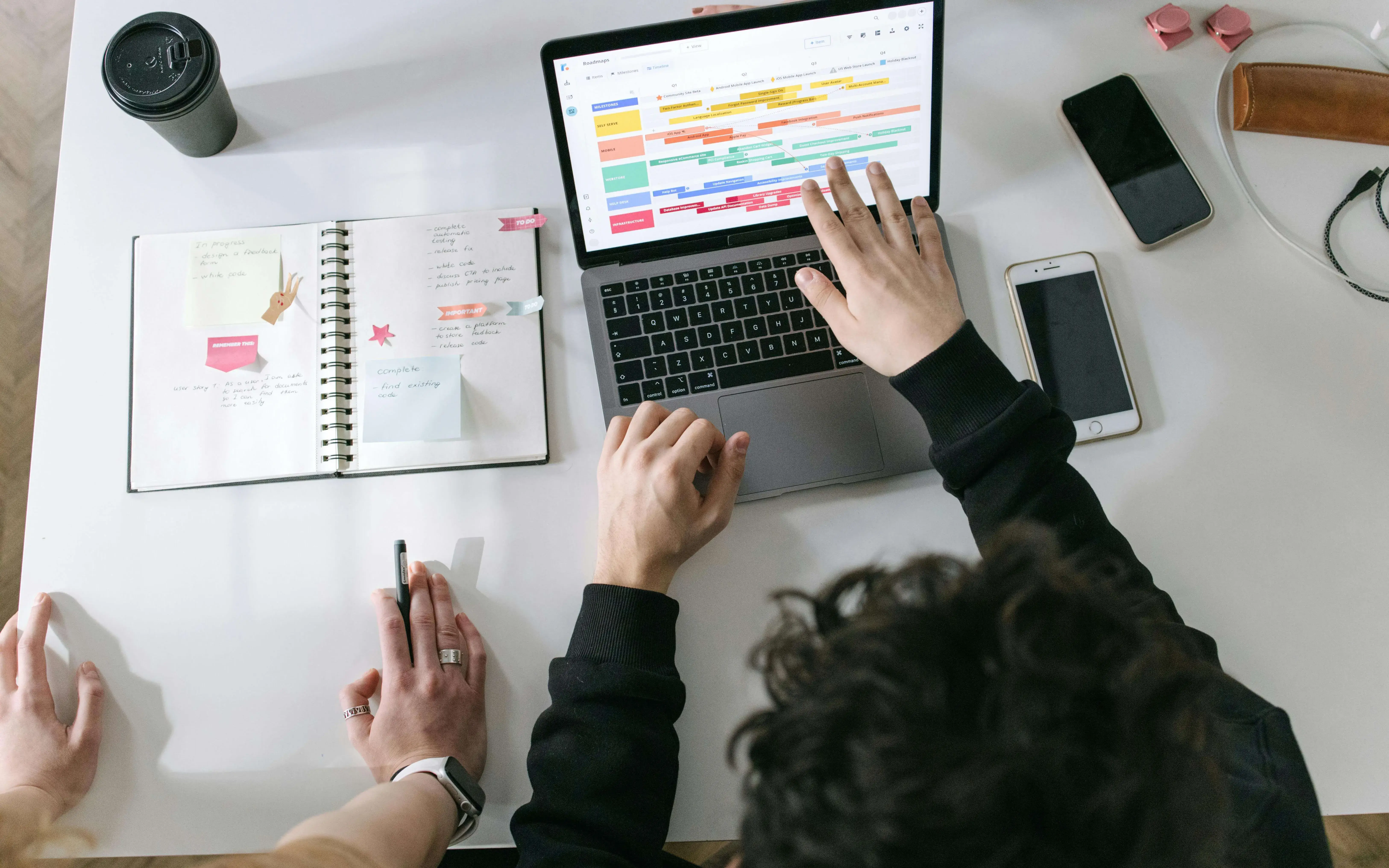
With the new emerging technologies, Nonprofit could not stay behind and that is the reason why we have a new responsive design, focusing on mobile first for this new stage of the portal. With a growing number of visitors accessing the portal on many different mobile devices and the different resolutions that go with these devices, it was paramount to have a high-quality website for users visiting us from any device. And together with this new design comes a whole new layout of content, since this couldn’t happen any other way.
Despite the many changes, the essence of the portal remains untouched. This means that the internal structure of the site is the same and the three sections on the site (news, interviews and editorials) are the same.
Images, audiovisual content and protagonists
With the arrival of new contents, there is a need to adapt formats and the new models of information have also brought changes to content presentation. Hence, Nonprofit strongly supports improving the quality of images, which will gain relevance in all three sections of our portal.
The added value of aesthetics
Aesthetics is another big change in the new website’s design. The new paradigm of communication leads us to seduce our portal’s visitors with the image of the portal itself. This means the new design has taken special care of the composition of the different elements in the portal, the layout of spaces and the clarity and simplicity of its structures.

Add new comment